San Francisco: Tech giant Google is changing its Chrome browser logo for the first time in eight years. The subtle change will give the product a “modern experience”, said Elvin Hu, a designer for Google Chrome.
He said the changes have been made based on the different operating systems Chrome appears on.
<>
We simplified the main brand icon by removing the shadows, refining the proportions and brightening the colors, to align with Google’s more modern brand expression. pic.twitter.com/Hyig51gqJq
— Elvin 🌈 (@elvin_not_11) February 4, 2022
</>
The new logo started rolling out from February 4 and is currently available on Chrome Canary (the developer version of the browser). It will be rolled out for everyone else over the next few months, he added.
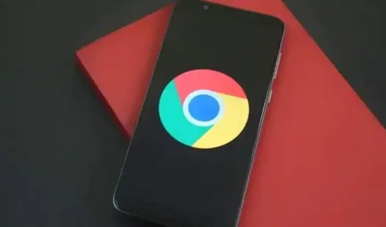
“We simplified the main brand icon by removing the shadows, refining the proportions and brightening the colors, to align with Google’s more modern brand expression,” said Elvin Hu.
Due to these changes, the blue circle in the middle seems to be bigger. The colours in the logo also look more vibrant.
The icon has been simplified/flattened by removing the shadows. The colours are brighter and the proportions are different, making the big blue ball in the middle noticeably bigger.
Comments are closed.